Easily analyse audio features from Spotify playlists — Part 3.
The part where we discover what separates Norwegian and Finnish metal.

Welcome back! In Part 1 you learned how to get audio features, metadata, and preview Mp3s from Spotify playlists using GSA. In Part 2 I showed you how you could use GSA as part of a larger data collection.
In Part 3 you will learn how to use GSA to build a dataset, visualise the data, and perform some basic statistical tests.
We will try to answer the research question:
Is there a difference between Finnish and Norwegian metal?

Metal music is a genre that’s been around since at least the early 1970s, brought around by bands such as Black Sabbath.
In the early 1990s the Norwegian extreme metal scene pioneered what has come to be known as black metal. Bands such as Mayhem, Darkthrone and Dimmu Borgir remain popular even today.
In Finland, the late 1980s gave rise to many heavy metal bands, culminating with the world-wide popularity of bands such as Stratovarius, Nightwish, and HIM in the early 2000s.
In addition to these more mainstream metal bands, Finland is well known for many of its death metal bands, such as Insomnium, Amorphis, and Children of Bodom.
In this mock-project we will try to quantify the difference between Norwegian and Finnish metal, using GSA to get metadata and audio features from Spotify’s API.
Prerequisites
This shows you how to get GSA up and running.
If you have already done Part 1, please go to the GSA repository and download the updated version.
This shows you a more advanced approach to using GSA.
- analysisRequirements.txt
We will use this file to install the packages we will be using.
- (Optional) metal_dataset_*.csv
These are three files which can be found in the GSA repository.
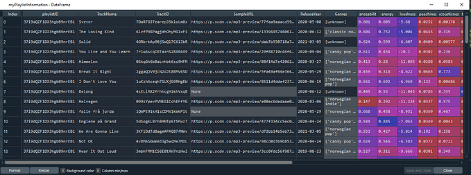
Building a dataset
This section covers the script GSA_buildDataset.py
We’ll build our dataset by collecting public playlists. We start off by importing the packages we’ll use:
import pandas as pd# Import GSA
import GSA
# this imports the functions used for getting information and preview-mp3s.# multiprocessing for improved speeed
from joblib import Parallel, delayed# tqdm for progressbar
from tqdm import tqdm
Then we’ll authenticate with Spotify’s API:
GSA.authenticate()Now we’re ready to search for playlists. GSA contains a function GSA.searchPlaylists() that works as a wrapper for Spotipy’s search function. This function takes as input a search term, a maximum number of playlists, and (optionally) a market. Market indicates a country, meaning that we search for playlists with tracks that are available in that market.
Let’s search for playlists using the search term “Finnish Metal” and “Norwegian Metal”:
# search for Finnish Metal playlists
finnishMetal = GSA.searchPlaylists(‘Finnish Metal’, number=400, market=’FI’)
# currently yields 142 playlists# search for Norwegian Metal playlists
norwegianMetal = GSA.searchPlaylists(‘Norwegian Metal’, number=400, market=’NO’)
# currently yields 165 playlists
We then check for duplicates, to ensure that we haven’t got the same playlist twice:
# check for duplicates
finnishMetal = finnishMetal.drop_duplicates(subset=[‘playlistID’])
norwegianMetal = norwegianMetal.drop_duplicates(subset=[‘playlistID’])
To trim our dataset a bit we select only playlists with over 20 tracks in them.
finnishMetal = finnishMetal[finnishMetal[‘nTracks’] > 20]
norwegianMetal = norwegianMetal[norwegianMetal[‘nTracks’] > 20]
We then add a categorical variable telling us whether a playlist is Finnish or Norwegian before we merge it into one big dataframe.
# add category
finnishMetal[‘category’] = ‘Finnish’
norwegianMetal[‘category’] = ‘Norwegian’# merge into one dataframe
playlists_dataset = pd.concat([finnishMetal, norwegianMetal], ignore_index=True)
At the time this script was written, this search resulted in 270 playlists. If you want to use the same playlists I have used, use the file metal_dataset_playlistsOnly.csv.
Downloading metadata and audio features
Our collection of playlists are now complete, and we can start downloading them, just as we did in Part 2.
IDlist_tqdm = tqdm(playlists_dataset[‘playlistID’], desc=’Getting audio features’)results = Parallel(n_jobs=8, require=’sharedmem’)(delayed(GSA.getInformation)(thisList) for thisList in IDlist_tqdm)
The first line creates a tqdm object which will give us a nice progress bar, as we downloading the info in parallel using the joblib package.
Note that some of our playlists are quite large.

These will take quite some time to download. If you want to skip this section, you can find the downloaded dataset in the “Data” folder on GitHub.
Once downloading has finished we’ll collect the playlist data from the .pkl-files saved in the Playlist folder.
output=[]
for thisList in results:
 if thisList == ‘error’:
 print(‘Found a playlist not downloaded.’)
 else:
 thisFrame = pd.read_pickle(thisList)
 output.append(thisFrame)

# flatten
output = pd.concat(output)
We’ll remove any track without metadata:
# remove any where TrackName is EMPTYDATAFRAME
empties = output[output[‘TrackName’] == ‘EMPTYDATAFRAME’]
output.drop(empties.index, inplace=True)
And then merge it with the original dataset to retain supplementary information.
# merge with original dataset to get supplementary information
merged_output = playlists_dataset.merge(output, on =’playlistID’, how=’left’)
We will save two versions of this dataset. As we have not curated our collection of playlists very well, there’s likely many duplicate tracks in there. We’ll get rid of those, and save a dataset with only unique tracks.
First save a version with all tracks:
merged_output.to_csv(‘Data/metal_dataset_allTracks.csv’, encoding=’UTF-8')Then, we filter out duplicates using the drop_duplicates function from Pandas, and we search for duplicates in a subset consisting of the TrackID and category:
merged_output_unique = merged_output.drop_duplicates(subset=[‘TrackID’, ‘category’])merged_output_unique.to_csv(‘Data/metal_dataset_uniqueTracks.csv’, encoding=’UTF-8')
Our dataset now consists of 58 729 tracks, which hopefully will let us answer some of our questions regarding Finnish and Norwegian metal. We’re now ready to do some analysis!
Data analysis
This section covers the script GSA_analyseDataset.py

In this section we will do a quick analysis of our dataset, and make some plots. We’ll be using the fantastic RainCloudPlots, and (ab)using Pingouin, a package for doing statistics in Python.
Installing requirements
To follow along with this part of the tutorial, you’ll need a few more packages. We’ll be using the plotting-related packages seaborn, ptitprince, matplotlib and wordcloud, and the stats package pingouin. You can either install these yourself, or use the analysisRequirements.txt file, as in Part 1.
Use your command-line interface, navigate to the folder where GSA is unzipped, and then type:
pip install -r analysisRequirements.txtOnce this is finished you are ready to do some plotting and analysis.
Reading the dataset and importing packages
We’ll first import all the packages:
# for handling data
import pandas as pd# plot-related libraries
import seaborn as sns
import matplotlib
import matplotlib.pyplot as plt
import ptitprince as pt
from wordcloud import WordCloud
from collections import Counter# for easier access to file system
import os# for stats
import pingouin as pg
Then we’ll read in the dataset, just as in Part 2:
dataset = pd.read_csv(‘Data/metal_dataset_uniqueTracks.csv’, encoding=’UTF-8', na_values=’’, index_col=0)We’ll be saving our plots to a folder called Plot, so we’ll make that if it doesn’t already exist.
# make a folder for plots
if not os.path.exists(‘Plots’):
 os.makedirs(‘Plots’)
Looking at genres
Our first analysis will be looking at the genres, which we will visualise as a word cloud. Each track on Spotify is associated with an artist, and most artist has genre tags. GSA saves these in a column called “Genres”.
Note: If a track has multiple artists, only the genre tags associated with the first artist is collected.
We’ll extract all the genre tags for the Finnish and Norwegian metal playlists separately. First, we need to get the genres, and split them into individual entries.
# Select first the Finnish genres
finnishGenres = list(dataset[dataset[‘category’] == ‘Finnish’][‘Genres’])
As an artist can have multiple genre tags, we need to strip and replace these strings so that we get each genre tag separately.
# strip and replace bits in the Genre strings
finnishGenres_long = []
for thisTrack in finnishGenres:
    thisTrackGenres = thisTrack.replace(‘\’’, ‘’).replace(‘[‘, ‘’).replace(‘]’, ‘’).replace(‘, ‘, ‘,’).split(‘,’)
    finnishGenres_long.extend(thisTrackGenres)
This is a little bit hacky, but generally what we do is that we get rid of some symbols, so that we can nicely split the genre tags.
If you can improve the code, feel free to make a suggestion on GitHub!
The variable finnishGenres_long now contains all the genre tags for our Finnish metal tracks. Now we’ll count the occurence of each of them, so we can make a scaled word cloud.
finnishGenres_count = Counter(finnishGenres_long)We’re now ready to make the word cloud! We’ll be using the wordcloud package, and save the plot to our Plots folder.
finnishWordcloud = WordCloud(stopwords=’unknown’,
        height=700,
        width=1400,
        min_font_size=4,
        colormap=matplotlib.cm.inferno,
        background_color=’white’)
.generate_from_frequencies(finnishGenres_count)
We first create a WordCloud object. There are two interesting parameters here: stopwords indicate words that are ignored. Here we’ll ignore “unknown”, which is what GSA outputs when no genre tag is found. colormap indicates how the individual genre tags are coloured, and here we choose the infero colormap from matplotlib.
We then use the function .generate_from_frequencies, which takes frequency (count) data as input, and feed it our counted Finnish genre tags.
We then save the plot, using the .to_file() function.
finnishWordcloud.to_file(‘Plots/finnishGenres.png’)Here’s the result:

Unsurprisingly, “finnish metal” is the largest genre tag, and both power metal, melodic death metal, and alternative metal are prominent in the dataset. There’s also a few interesting ones here, such as “christian pop”, and “post-teen pop”, which indicates that our collection of playlists perhaps are in need of a bit of curating.
Following the same procedure for the Norwegian playlists we get this word cloud:

Also not surprising, the most common genre here is black metal and Norwegian black metal. In general though, there’s quite a bit more black metal than in the Finnish word cloud. There’s also some “Swedish metal” in there, again suggesting that our dataset is in need of refinement.
Looking at release years
It is also interesting to see if we can spot a difference in “productivity” between Norwegian and Finnish metal. We can inspect that by looking at the release date of the tracks in the database. GSA stores this in the “ReleaseYear” column. For some tracks, we get a full date, and for others we only get the year. The year is always first, which we can use to preprocess our data.
For this example, let’s take the Norwegian metal tracks. We first select only the Norwegian category, and then the ReleaseYear column. We treat this as a string where we only take the 4 first elements, and then cast it as an integer:
norwegianYear = dataset[dataset[‘category’] == ‘Norwegian’][‘ReleaseYear’].str[0:4].astype(int)Note, if GSA doesn’t find a release date, it will set it to 0. We can filter those out:
norwegianYear = norwegianYear[norwegianYear > 0]To get a good feeling for the distribution here we can use many types of visualisation. For this particular example, we’ll go for a density plot, where we’ll use kernel density estimation to smooth out our curve. Here we’ll use the package Seaborn.
norwegianYearPlot = sns.displot(norwegianYear, kind=’kde’, clip=(1940,2021), bw_adjust=.5)Here, kind=’kde’ indicates we’re using kernel density estimation. Clip simply starts and stop our estimation, and here we choose 1940 and 2021 as start and end point. The bw_adjust parameter allows us to control how fine-grained our estimation is.
To ensure that our plots have the same scale for both Norwegian and Finnish release years we set the x and y limit manually before we save the plot:
norwegianYearPlot.set(xlim=(1938,2021), ylim=(0,0.07))
norwegianYearPlot.savefig(‘Plots/NorwegianYear.png’, bbox_inches=’tight’)
Here’s the results:

Here we can quite clearly see how the early 1990s was a kick-start for Norwegian metal, with another big upswing in the mid 2000s. Note however, that this may not actually be true. We’re looking only at tracks that are both available on Spotify and popular enough to be included in the public playlists we collected, hence our interpretation carries more than a bit of bias.

Interestingly though, by comparing the Norwegian and the Finnish distribution, we see that the Finns were late to the party, with their upswing only starting late in the 1990s. On the other hand, it appears to be a much smoother and continuous rise than for Norwegian metal.
Audio features
The final part of our analysis is were we look at Spotify’s audio features, do some statistics, and then make some plots.
Spotify’s audio features are precalculated measures of both low-level and high-level perceptual qualities of music. Some of them are easily interpretable, such as Loudness and Tempo. Others are more compounded and complex measures, such as Danceability and Valence. For an overview of how to interpret these audio features, see Spotify’s API documentation, or read our preprint here.
We’ll start of by doing some statistics.
Statistics
There are many ways of doing a statistical comparison between two groups. Here, we’ll refrain from discussing this in detail, but instead show how to do a simple T-test on some of the audio features. This gives us an indication of whether there’s a statistically significant difference between the audio features of Finnish and Norwegian metal.
First, we’ll subset our dataset to only contain category (Norwegian or Finnish), and the audio features:
audiofeatures = dataset[[‘category’,
 ‘danceability’,
 ‘energy’,
 ‘loudness’,
 ‘speechiness’,
 ‘acousticness’,
 ‘instrumentalness’,
 ‘liveness’,
 ‘valence’,
 ‘tempo’,
 ‘key’,
 ‘mode’]]
To make our calculations a bit smoother, we’ll separate this into two dataframes, one for Norwegian metal and one for Finnish metal:
norwegianValues = audiofeatures[audiofeatures[‘category’]==’Norwegian’]finnishValues = audiofeatures[audiofeatures[‘category’]==’Finnish’]
We’ll then make a list of the audio features we want to compare:
features =[‘danceability’,
’energy’,
’loudness’,
’speechiness’,
’acousticness’,
‘instrumentalness’,
’liveness’,
’valence’,
’tempo’]
The T-test is performed using Pingouin’s ttest function. This function outputs a Pandas dataframe with all the relevant information. We’ll do our actual calculation in a loop, to go through all the features.
# this will hold the statistics
statHolder = pd.DataFrame()# do the comparisons in a loop
for thisFeature in features:
    # unpaired two-sample T-test using Pingouin
    output = pg.ttest(finnishValues[thisFeature],
                      norwegianValues[thisFeature],
                      paired=False,
                      tail=’two-sided’,
                      correction=’auto’)
                      output[‘feature’] = thisFeature
    statHolder = statHolder.append(output, ignore_index=True)
While I won’t go into detail on the actual statistics here, the short story is that this will output two variables which we’re interested in. statHolder will now have a column called “p-val” containing the p-values and a column called “cohen-d” containing Cohen’s D (a measure of effect size).
Generally, with dataset as large as these, even tiny differences between distributions will be considered statistically significant. However, this does not always mean that something is meaningfully different. The effect size, in this case Cohen’s D, gives an indication of the magnitude of the difference.
We just did a bunch of T-test, and this usually means we should correct for multiple comparisons. Here we’ll use Bonferroni correction.
Pingouin comes with a function that does corretions:
bonferroniCorrected = pg.multicomp(list(statHolder[‘p-val’]), alpha=.01, method=’bonf’)This gives us an array containing a boolean True/False whether a comparison was statistically significant (note that we set alpha, the significance threshold, to 0.01), and the corrected P-values.
Let’s add these into the statHolder dataframe, and write it to disk:
# extract the corrected p-values
statHolder[‘p-corr’] = bonferroniCorrected[1]
# extract a logical array if test is significant
statHolder[‘significant’] = bonferroniCorrected[0]# write the statistics to file
statHolder.to_csv(‘Data/metalComparison.csv’, encoding=’UTF-8')
Great! We have now done a bit of statistics. If you inspect the statHolder variable, you can see that most of our comparisons are significantly different, but the effect size varies alot.

Let’s visualise this!
Raincloud plots
For this section we’ll use Raincloud plots.
We’ll go through each of the audio features we just compared, make a plot, and add some statistics to the plot. First, we make a list of the audio features we want to plot:
features =[‘danceability’,
’energy’,
’loudness’,
’speechiness’,
’acousticness’,
‘instrumentalness’,
’liveness’,
’valence’,
’tempo’]
Now, we’ll do the plot in a slightly ugly loop:
# make the plots in a loop
for thisFeature in features:
    # Make a name for the figure
    saveName = ‘Plots/MetalComparison-’ + thisFeature + ‘.png’
    # draw the plot
    f, ax = plt.subplots(figsize=(7,5), dpi=300)
    pt.RainCloud(x=’category’, y=thisFeature, data=audiofeatures, palette=’Set2', bw=.2,
 width_viol=.6, move=.2, ax=ax, orient=’h’, point_size=.35,
 box_showfliers = False)
    # Let’s try to draw statistics in the plot as well
    # get stats for this feature
    thisStat =       statHolder[statHolder[‘feature’]==thisFeature].reset_index()
    # check if significant
    isSignificant = thisStat[‘significant’]
    signifStar = ‘’
    if isSignificant[0]:
        # you can use this to add a significance star somewhere
        signifStar = ‘* ‘
    # get p-value
    pVal = thisStat[‘p-corr’]
    # if pVal is below 0.0001, then print as p < 0.001
    if float(pVal.round(3))<=0.0:
        pVal = ‘< 0.001’
    else:
        pVal = ‘= ‘ + str(float(pVal.round(3)))
    # get Cohen’s d-value
    dVal = thisStat[‘cohen-d’]
    # make a string with the statistics
    statText = signifStar + ‘P ‘ + pVal + ‘, Cohen\’s D = ‘ +    str(float(dVal.round(3)))
    # add title
    plt.suptitle(thisFeature.capitalize())
    # add statistics
    plt.title(statText)
    plt.xlabel(‘Value’)
    plt.ylabel(‘’)
    # save the figure
    plt.savefig(saveName, bbox_inches=’tight’)
This needs a bit of unpacking. Let’s start with the basics:
for thisFeature in features:This takes goes through each element in features, and we can access it in the thisFeature variable. For the first round in the for-loop, thisFeature is “danceability”.
saveName = ‘Plots/MetalComparison-’ + thisFeature + ‘.png’This creates a string which we’ll use to save the plot. Since thisFeature is “danceability”, this will be “Plots/MetalComparison-danceability.png”.
f, ax = plt.subplots(figsize=(7,5), dpi=300)pt.RainCloud(x=’category’, y=thisFeature,
data=audiofeatures, palette=’Set2', bw=.2,
width_viol=.6, move=.2, ax=ax,
orient=’h’, point_size=.35,
box_showfliers = False)
This makes the actual Raincloud plot, using the RainCloud function from the ptitprince package. On the x-axis we select the column “category”, which is either Norwegian or Finnish metal. On the y-axis we select “thisFeature”, which will change throughout the loop. The data comes from our audiofeatures dataframe. The remaining parameters can be seen in the RainCloud tutorial. There is one trick here though, which is box_showfliers = False. This disables outilers on the box plot.
Now we’ll try to add some statistics. We want to add the P-value and the Cohen’s D to our plots. In addition, we’ll make a little star, *, to indicate if a comparison was significant.
First, we get the statistics for this audio feature:
thisStat = statHolder[statHolder[‘feature’]==thisFeature].reset_index()We then check if it remained significant after Bonferroni correction:
isSignificant = thisStat[‘significant’]
signifStar = ‘’
if isSignificant[0]:
    signifStar = ‘* ‘
What we did there was to make a string, signifStar, which is empty by default, but contains a * and a space if the comparison was significant.
We then get the P-value:
pVal = thisStat[‘p-corr’]
# if pVal is below 0.001, then print as p < 0.001
if float(pVal.round(3))<0.001:
    pVal = ‘< 0.001’
else:
    pVal = ‘= ‘ + str(float(pVal.round(3)))
If the P-value, rounded to 3 decimals, is less than 0.001 we choose to display this as ‘< 0.001’. Otherwise, we want to show it as “= actual value”.
We then extract the Cohen’s D value:
dVal = thisStat[‘cohen-d’]Now we format this into a nice string:
statText = signifStar + ‘P ‘ + pVal + ‘, Cohen\’s D = ‘ + str(float(dVal.round(3)))All that’s left is adding labels, titles, and saving the figure. A little trick here to get a main title and a subtitle is to use plt.suptitle for the main title and plt.title for the subtitle.
# add title
plt.suptitle(thisFeature.capitalize())# add statistics
plt.title(statText)plt.xlabel(‘Value’)
plt.ylabel(‘’)# save the figure
plt.savefig(saveName, bbox_inches=’tight’)
And that’s it! You should now have nine new plots in your Plots folder. Let’s take a look.
Results
Let’s take a look at a few of the audio features comparisons. We’ll start with the highest Cohen’s D, danceability:

At first glance, we can see that there’s quite a clear difference in the median values here. Finnish metal music appears to have a much higher danceability value than Norwegian metal. For an interpretation of danceability, see our preprint here.

Valence is a compound measure that Spotify claims measure the musical positiveness conveyed by a track. Interestingly, Finnish metal seems to have both a higer median value, but also a more wide distribution. This is quite a bit in contrast to normal stereotypes of Finnish mood.

On the other hand, there appears to be no real difference in the Energy values, which likely has much to do with the sonic landscape of extreme metal in general.
For a full overview, try inspecting the plots in your Plots folder.
Summary
This concludes part 3, and this series of how to easily analyse audio features from Spotify playlists! We built a dataset of Norwegian and Finnish metal, and found out that the Swedes snuck into our dataset. Unsurprisingly, most tracks were from the 1990s and onwards. A bit more surprisingly, Finnish metal appears to be both more happy and danceable than Norwegian metal.
Hopefully you’ll now be able to do some more scientifically oriented and rigerious enquiries.
If you end up using code from this project in any scientific output, please cite our preprint.
And if this little tutorial has made you interested in Norwegian and Finnish metal, my personal recommendations are Insomnium from Finland, and Nergard from Norway!